

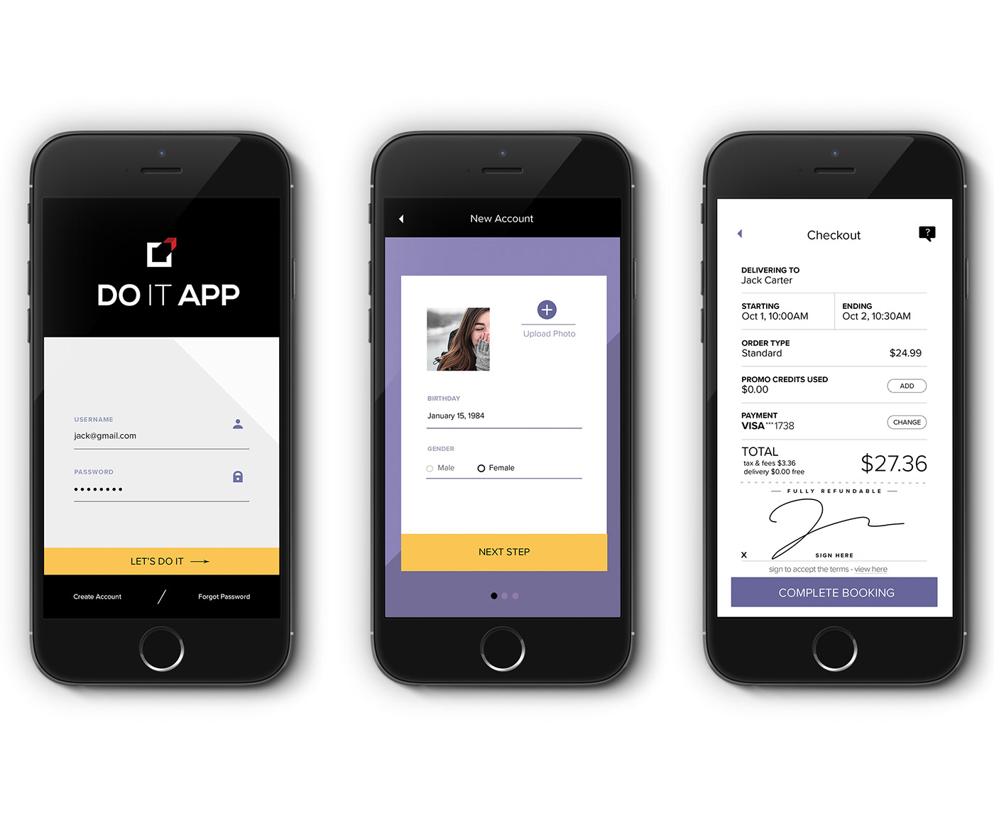
The Do It app is a native self-help mobile app created for those who want to see a change in their lives and are ready to do something about it.
Project UX Goals:
- Design a fun and engaging user experience that makes self-help and life-coaching resources less woo-woo and more practical.
- Stay focused on highlighting the value of the experiences life can bring when a person uses this app
- Incorporate a social community component to encourage togetherness and make it a "cool" experience visually.
Product Design Objectives:
1. Create a brand image for the Do It app that is elegant, playful, and presents an attractive platform for potential advertisers
2. Ideate three relevant revenue-generating features
3. Make the in-app purchase experience simple and modern
Product Design Project Process
1. UX Designer Onboarding - Understanding the Product and its Market
2. Establish Brand Philosophy*~
3. Establish User Personas*~
4. Outline the user’s experience from an emotional journey perspective*~
5. Design the user flow and define messaging approach*
6. Craft the Content*~
7. Function (usability) and Feature Test with Lo-Fi Wireframe Prototype (Internal)
8. Create Visual Design System and conduct a small-scale test with a high-fi prototype
9. Enhance the product’s features and click-through experience based on the small-scale usability test results. The testing methods used include feedback through an internal survey, a controlled, online UX trial, and A/B Testing of critical transition screens conducted as a work-in-progress product review using the brand’s initial social media audience*
10. Update prototype and content with improvements based on test results, survey and user comments, and stakeholder feedback*~
11. Hand-off to Development*
12. Launch the first iteration
Up Next: Improvements based on initial launch feedback. Monitor social media and digital product reviews for feedback regarding bugs and usability issues*
* denotes client approval or sign-off required
~ denotes a completed Developer hand-off deliverable
~ denotes a completed Developer hand-off deliverable
Design Challenges:
- How do we address or avoid the stigma of “Self-Help”?
- The need for modernizing the Spiritual/Self-Help Sector’s Visual Design branding.
- Convincing Potential Users to download the app without unintentionally appearing religious or new-age. Messaging must compel and persuade using strategies that do not sound “preachy.”
- Protecting User registrations and social interactions from Extremists and Cyber Bullies
- Develop the app with a low startup budget because it is not yet funded, and, of course
- The standard time constraints involved in launching a new product

Building with Purpose
STEP ONE: Establishing the Brand Philosophy
Why start with the brand philosophy instead of starting with the user? Because, for this type of product, we must be very clear on who we are as a service. Self-help is a sensitive field with a lot of unworthy players, so to become a front-runner, consistency and clarity of message will be key.
Boldly and without ambiguity, we must be clear about who we are and define who we want to reach.
Branding a Vision
Establishing the brand’s philosophy primarily involves connecting with its founder and creator. It is getting down to the aspects of why this product was concepted and the vision for its future.
Establishing the brand’s philosophy primarily involves connecting with its founder and creator. It is getting down to the aspects of why this product was concepted and the vision for its future.
During this stage, the brand’s personality and tone of voice are established and communicated using words and visuals. In the case of the Do It App, this meant being very careful to not come off as being religious or outdated in terms of solving life issues.
Instead, the tone of the brand needed to be young, modern, energetic, and “real.”.
Though the app is ultimately about spiritual growth topics, it deals with our approach to spirituality in a way that encourages users to do more, not less. To be more expressive, not self-restrictive. The Do It app promotes freedom and in designing the product, messaging that puts that agenda on display.
Though the app is ultimately about spiritual growth topics, it deals with our approach to spirituality in a way that encourages users to do more, not less. To be more expressive, not self-restrictive. The Do It app promotes freedom and in designing the product, messaging that puts that agenda on display.
The tone of the brand needed to be young, modern, energetic, and “real.”
Though the app is ultimately about spiritual growth topics, it deals with our approach to spirituality in a way that encourages users to do more, not less. To be more expressive, not self-restrictive. The Do It app promotes freedom and the product's design and messaging put that agenda on display.
Though the app is ultimately about spiritual growth topics, it deals with our approach to spirituality in a way that encourages users to do more, not less. To be more expressive, not self-restrictive. The Do It app promotes freedom and the product's design and messaging put that agenda on display.

Setting the Stage for a Great Experience
Do It is about dropping your guard and following your heart.
Every message, image, and interaction is designed to support that adventurous attitude and ignite the passion for exploration that dwells within each one of us.
STEP TWO: Defining the UX Approach and Methodologies
How we go about gathering data with so many UX research methodologies?
The research tactics implemented are determined by the type of information we are either missing or opportunities for improvement that were identified by stakeholders and any initial research.
Establish User Personas
At its core, designing a great user experience is about honest communication that persuades because it delivers the right message to the right audience in the right way. This means appealing to potential buyers in a way that affects their behavior simply because the product is offering something the user truly needs.
For any product, an honest approach to marketing helps to supersede the negative association audiences have with advertising, which gives your brand a fighting chance for visibility and acceptance.
The only way to persuade a group or individual is by, first, gaining their attention long enough for them to engage.
To earn attention, you must know who they are and what they react to or want to hear. Therein lives the incredible value of UX design.
For the Do It app to be successful, it had to know its users well enough to get them beyond thinking, “oh, that’s a neat idea for an app,” and find a way to build excitement and curiosity within them so their response could shift to something more like, “maybe this is exactly what I’ve been looking for to help me feel good again. I’m going to give it a try.”
Though both responses are positive, one comes from an adopted user (the goal of this project) the former, a passing word that has little chance of converting.
Acquiring user data and transferring that information into product design action items will determine which type of response your brand interactions will create.
STEP THREE: Outlining the Experience
Custom-designed UX strategies provide three outstanding benefits:
1. Time saved because the guess-work is gone and we can make deliberate product design decisions
2. Lower development costs because of a reduction in required “reworks”
3. Improved retention and repeat visits because of an optimized initial interaction with the brand
70% of Enterprise CEOs view UX as a Competitive, Differentiating Factor.
This is where the time invested in user research begins to show its real value.
Turning Analytics into User Action
The more you know about your user, the more your relationship can grow.
Today, "selling" one user can potentially be a gateway to more users, and a loyal user has the potential to provide a limitless number of leads.
Today's customers become ambassadors for the brand by sharing their interactions with family and friends. It's up to product designers, marketers, developers, and customer liaisons to make sure those interactions produce positive feedback.
STEP FOUR: Crafting the Content
With the personal and specific knowledge gained from user research, we learn values, emotional triggers, and personal preferences.
Using this information, we can tailor the way we present brand content to better match user expectations. We can also fulfill their product-based needs and exceed the value of other options provided by similar services they previously encountered.
In short, this means we can structure our content and click-through specifically to the user’s personal preference. The result will endear the user to our brand, increase likeability, and significantly increase the odds of success.
Bringing the Experience to Life
Good user interaction is like a pebble dropped into a lake. It has the power to create a ripple effect that extends well beyond the initial point of contact.
Knowing who our target users are and how they experience both life and digital products on a daily basis helps clarify their needs and highlights areas and opportunities for a new product to shine. By enhancing product features, we can remove service gaps and deliver a product experience that is intentional and catered toward making our users happy.
STEP FIVE: Usability Testing and Improvements
Products that have a long "shelf-life" have a habit of evolving with the times.
In addition to listening to user feedback and continually monitoring competing products and services, design updates that keep our app's functionality, content, and technology up-to-date should also be a priority.
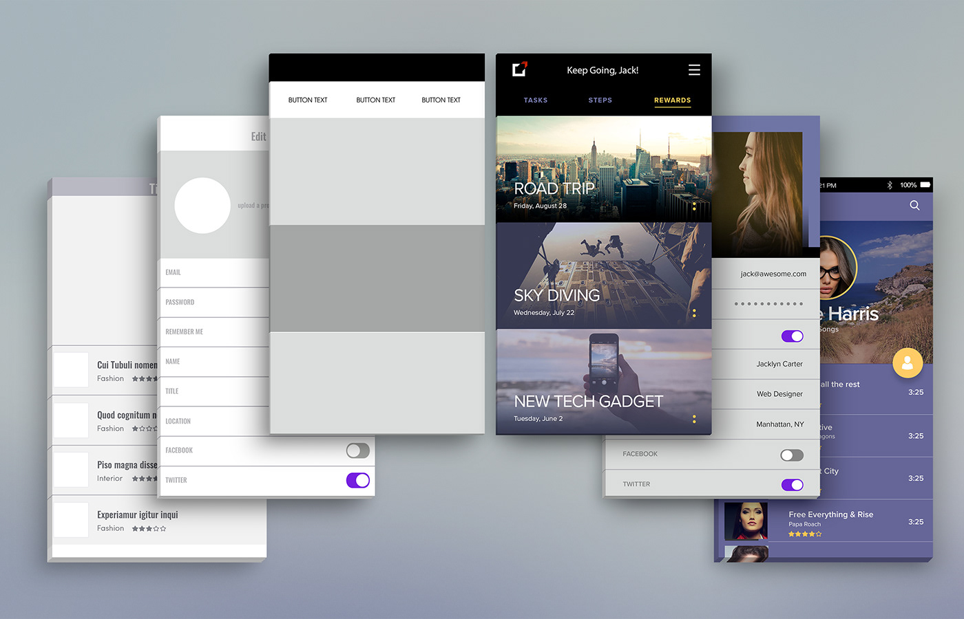
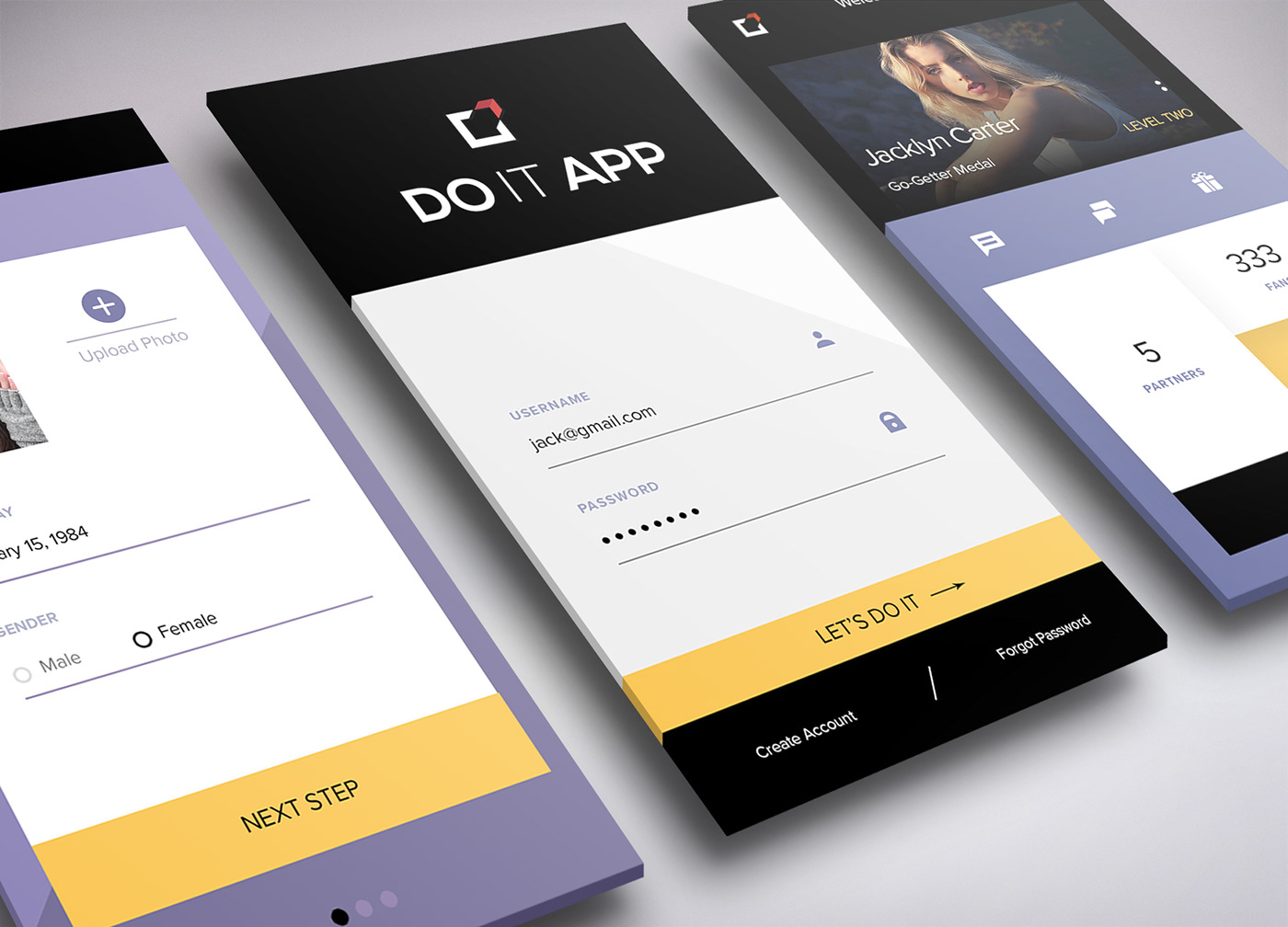
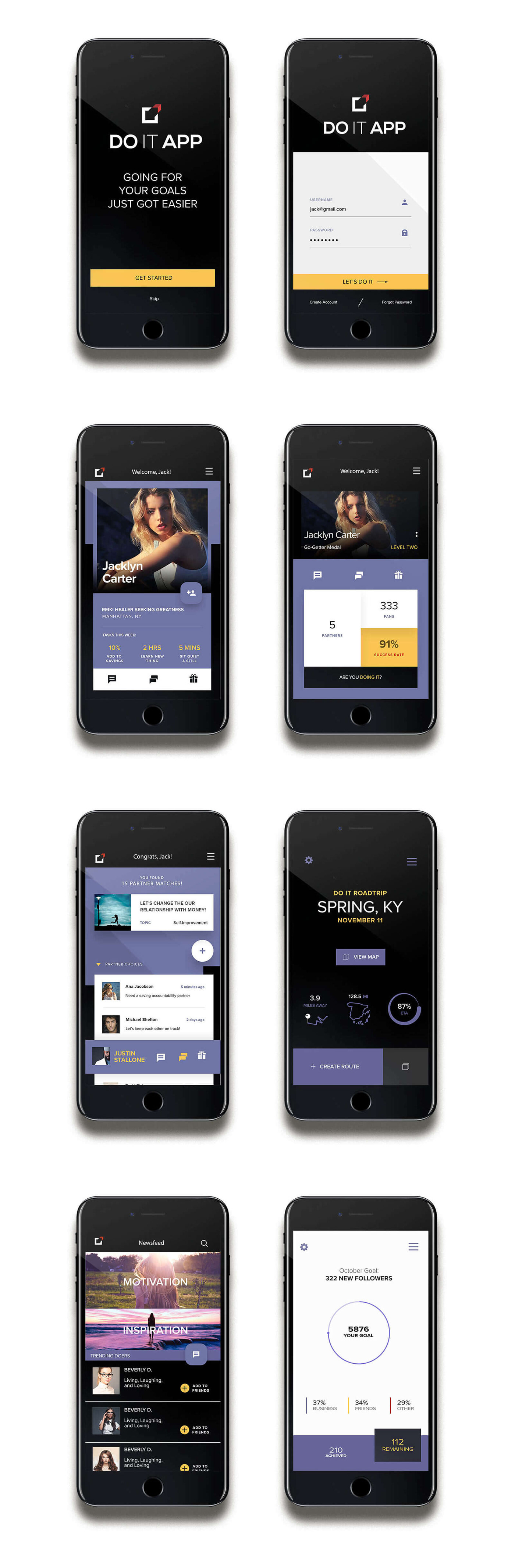
Try out the Do It app prototype below!
I hope you like this work!
If you need help nailing the brainiac portions of your product design, feel to send me a message. Thanks for sharing this moment with me.
Please do {{thumbs up}} and follow me if you enjoyed the journey :)
Find the updated and easier to follow case study in my portfolio here:
https://bridgette-bryant.com/portfolio/motivation-app-product-design/


